introduction
Recent research on grocery shopping trends shows a dramatic increase in online shopping done by Millennials, with 1 in 4 shoppers using online-only retailers and nearly half of Millennials shopping in online-only retailers.
Our partnership with Grocery Gateway allows us to investigate the Grocery Gateway mobile app experience in Millennials to discover insights and areas of improvement.
Research has pointed to four key factors that Millennials look for and value when shopping online:
CONVENIENCE
TRANSPARENCY
PERSONALIZATION
A SHOPPING EXPERIENCE
The Design Process
Early User Observations
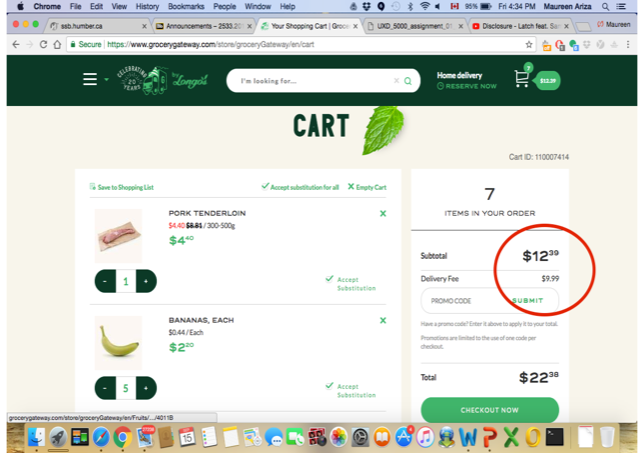
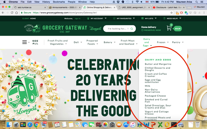
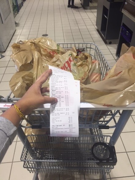
Before delving into how Grocery Gateway users navigate the online shopping world, we wanted to first step into their shoes by conducting informal observations and contextual inquiries of our personal shopping experience in a physical and online setting.
This was an important first step to:
Compare and contrast the physical shopping experience to the online grocery shopping experience.
Understand how to better improve the User Experience in an online grocery shopping environment.

Persona Development
In order to better understand our users, User Personas of both current and new Grocery Gateway users in the Elite Professional (Millennial) group were developed.
Although they provide a theoretical foundation for gaining insights on how these users think, act and feel, our User Personas cannot be a substitute for real users.

ELIZABETH HARRINGTON, 35 - MUSICIAN

NATE CAMPBELL, 28 - IT SPECIALIST
User Scenarios - Mobile Tasks
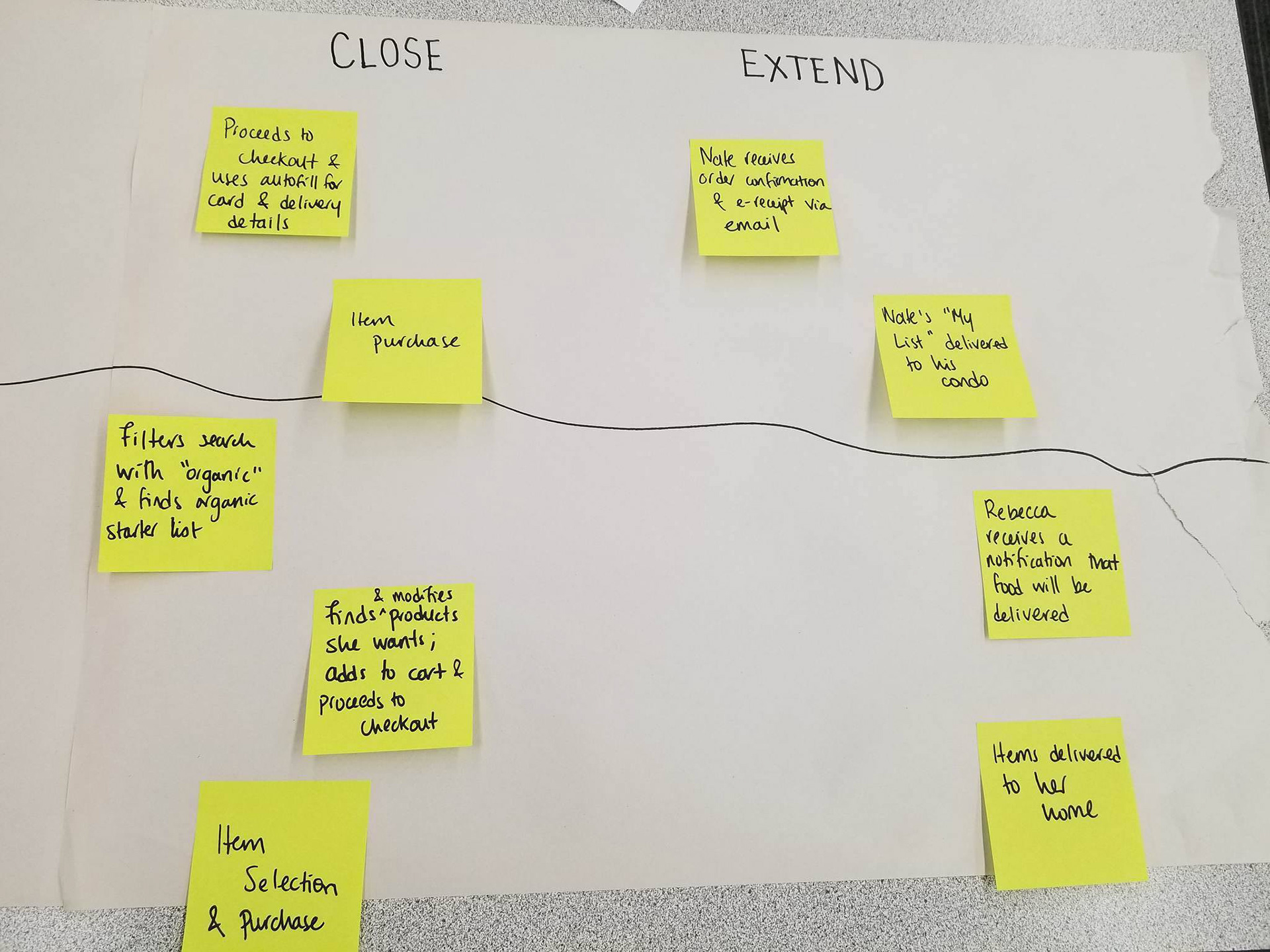
We wanted to place Nate and Elizabeth in specific scenarios and hypothesize how they would use Grocery Gateway on their phone.
This gave us a rough idea of how real users would use the app given a specific scenario.
Nate
"I'm always in a rush so I always grocery shop for the same things"
Elizabeth
"I prefer to buy organic/locally sourced food"

Formal User Interviews
OPPORTUNITIES
Gather audiovisual data on how users, both new and current, use the Grocery Gateway mobile app.
Gain insights on the experience of placing an order, modifying an order and cancelling an order.
Gather feedback and comments on positive and negative aspects of the Grocery Gateway mobile experience.
Observations and feedback might lead to other questions and problem areas not previously thought of or investigated.
CHALLENGES
Time constraints - We had less than an hour available per user.
Misinterpreting feedback and comments from users - Teamwork, collaboration and different viewpoints become key.
Avoiding researcher bias - Analyzing our research findings and providing design recommendations with the user in mind.
Context of Interview - Affects interaction of user with the app in their normal environment.
Summary of Research Findings
NEW USERS - "THE ELIZABETHS"
User experienced some difficulty using the search bar.
The user was unsure whether their order had been submitted due to lack of official confirmation.
Placement of the “View/Edit Order” button was not in line with the user’s natural task flow.
“Print Order” button on the mobile version of the Grocery Gateway app is redundant.
Changing/Modifying a delivery address after an order is submitted is a difficult and time-consuming process.
CURRENT USERS - "THE NATES"
For Elite Professionals, it’s all about saving time and increasing efficiency; systemizing this process is important: from placing an order to choosing a delivery time to receiving and checking email confirmations.
Grocery Gateway app is used to do smaller scale stuff such as modifying/canceling an order. Placing of order is done through desktop.
"My Lists” is a central component of the Grocery Gateway experience, acting as a memory trigger.
User has trouble when selecting a Payment Method. Clicking “Select” Option is not intuitive.
Not all items were on user’s “My List” when they looked for them (ex. Regular Raspberries).
Affinity Diagramming
Four major themes were gathered:
CONVENIENCE
TRANSPARENCY
PROCESS
FUNCTIONALITY ISSUES
Customer Journey Mapping
We were able to break down the experience into six stages:
Accessing the app
Navigating and choosing items
Reviewing order
Purchasing items
Reviewing and finalizing stage
Submit stage
We found many touch-points along with their respective thoughts and feelings.
However we were able to pinpoint two moments of truth:
“My Lists” is a central component of the app, acting as the equivalent of the user walking up and down the aisle in a grocery store.
User has difficulty in selecting the payment option; they can only click “Select” instead of the entire box.
Wireframing
Although there were many opportunities for design improvement, we focused on one:
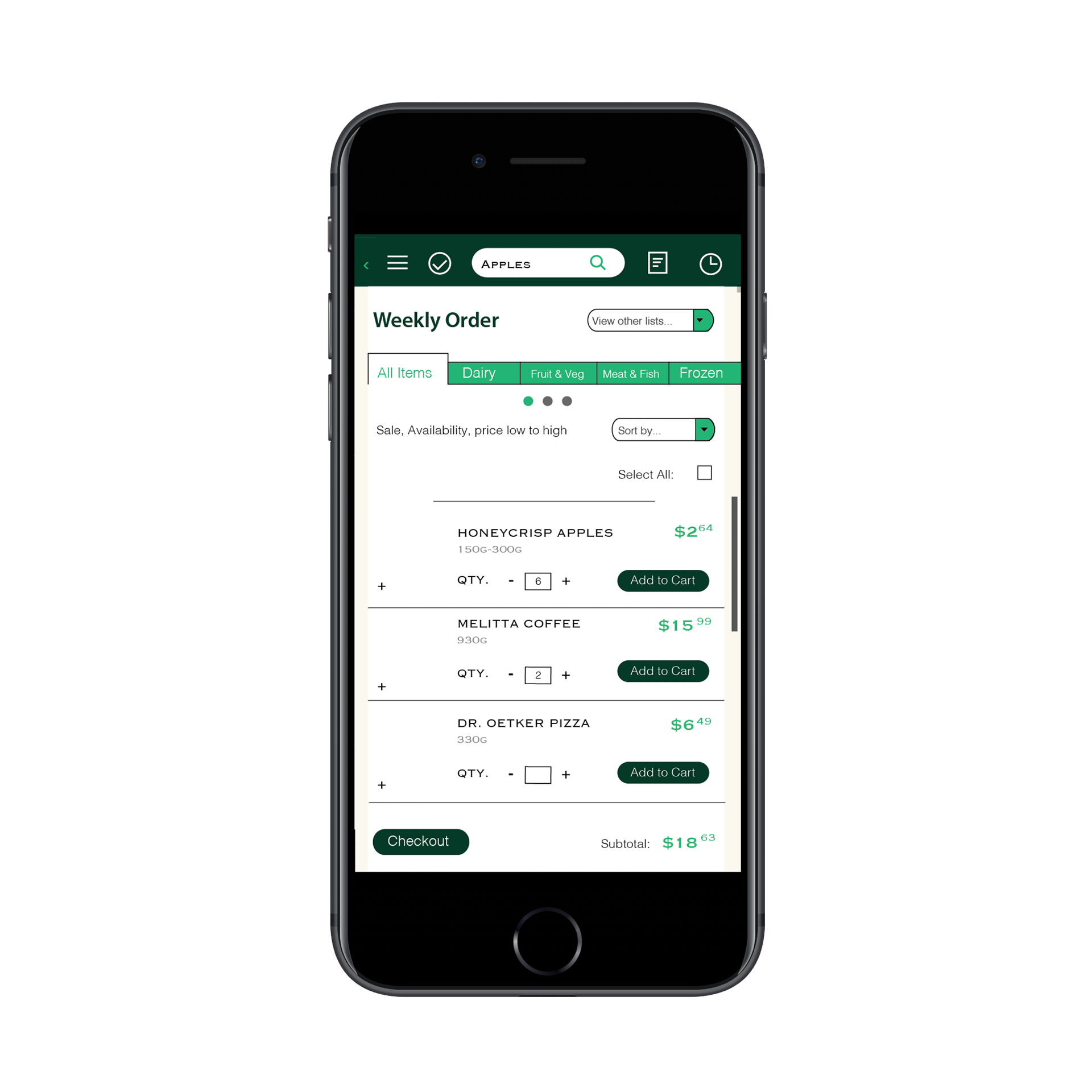
Rearranging the "My Lists" component on the mobile Grocery Gateway app such that users can better find the items they have already placed on their list.
We found that for our current user, "My Lists" is a central component of their Grocery Gateway experience, acting as a memory trigger akin to walking up and down the aisles.
We wire-framed some early ideas to bring our designs to life.
ONE
"My Lists" Menu will be a drop down Menu.
TWO
Upon clicking "My Lists", drop down menu will populate with user's saved lists, similar to what is already present on the Grocery Gateway website.
THREE
"Sort By" Menu will filter products by: Date Added (Most Recent to Least Recent), Product Name A-Z, Product Name Z-A as it is listed on the Grocery Gateway website.
FOUR
Type of product will be categorized by sub-categories present on the Grocery Gateway website. Tabs will populate according to what user has added to their list.
For example, if user only adds dairy products, only the Dairy tab will populate.
FIVE
Items will be displayed such that an image of an item will show its name, description as well as an option to modify the quantity. A checkbox towards the right of the page will signify adding an item to the cart.
SIX
Option will be given to users to purchase all items on the list, or purchase selected items. "Purchase" here is the equivalent of "Add to Cart".
SEVEN
If the user has items on their list that cover more than 5 sub-categories, the user will be able to scroll between the tabs with the coloured dots indicating their place on the tab bar.
Prototyping
Our main goal here was to:
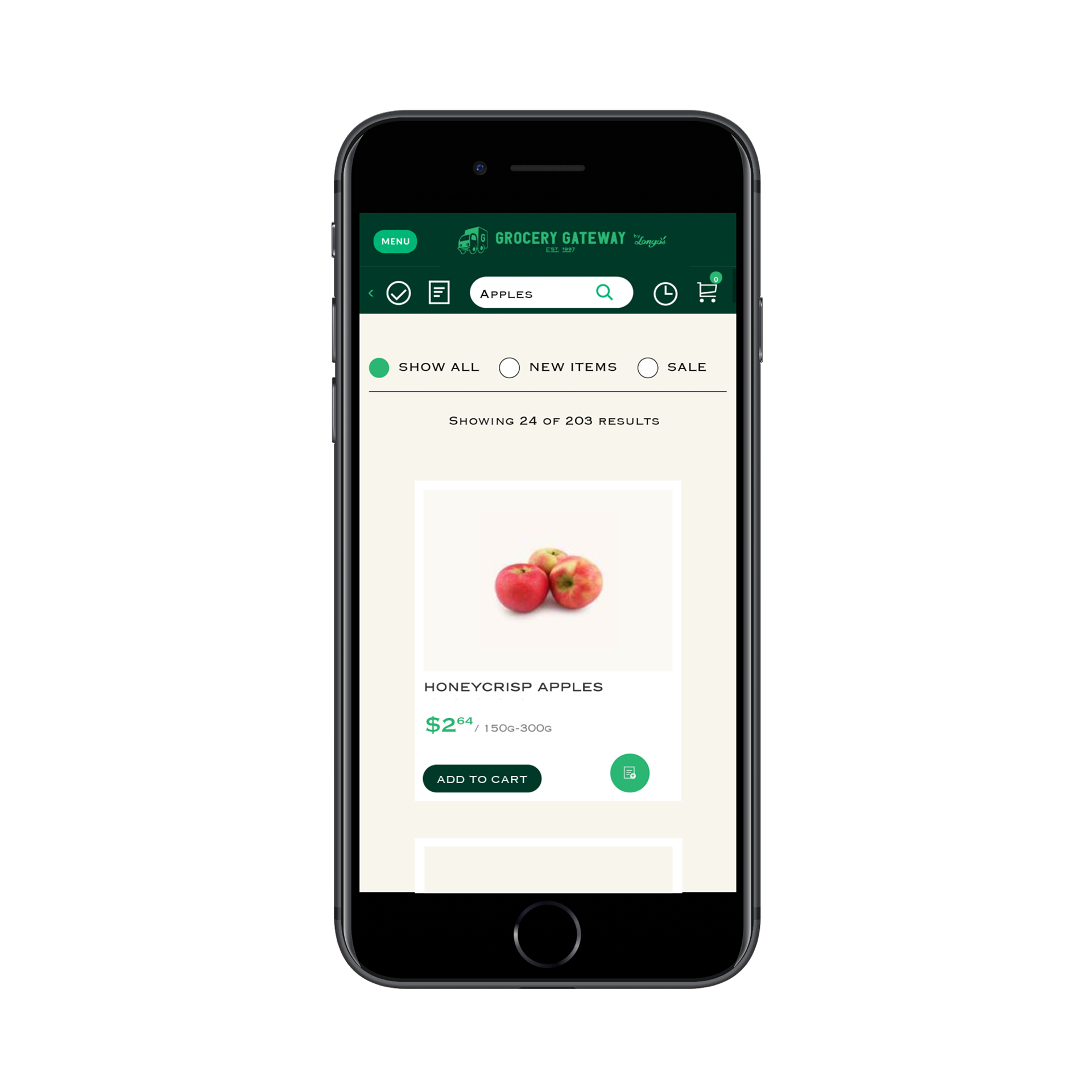
Categorize products in line with the sub-categories present in the existing Grocery Gateway app.
Cut down the number of steps a user needs to complete a certain action.
Make better use of screen space.
Make the "My Lists" feature overall more accessible from different parts of the app.


Conclusions & Next Steps
DEVELOP A MORE THOROUGH/COMPLETE PROTOTYPE OF “MY LISTS” FEATURE
Develop a prototype that takes into account all the possible steps and user actions with respect to the redesign of “My Lists” feature.
USER TESTING
Launch user testing sessions implementing the new design of “My Lists” feature.
Collect feedback from users & other relevant stakeholders and make changes as needed.
